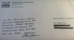
 The minute I saw this envelope I knew the package was doomed. The OE (outer envelope) had a huge flaw. Unfortunately, the OE wasn’t the only thing wrong with this piece. There were three significant problems with this appeal.
1. Dirty data. This mailing is addressed to my wife. Sort of. You see, my wife’s name is Deborah, it isn’t Debbie. In the nearly 20 years that I’ve known her, she’s never gone by Debbie. She hates the name Debbie.
This is a nonprofit that we know well — and they should know us. It’s the high school where Deborah and I attended (where we met and began dating, in fact). In the four years that Deborah attended this institution, she never went by Debbie. I can only speculate as to how or why they’ve shortened her name in their database. But regardless of the how or why, it really never should have happened.
Takeaway: Don’t manipulate donor data unless you are absolutely certain the change is appropriate. As tempting as it might be, don’t create nicknames for your constituents or shorten/lengthen a name unless your constituent asks you to do so. One of the most frequent complaints from donors is that nonprofits misspell their names, use the wrong name or otherwise butcher their name. It’s a dumb mistake. Don’t do it.
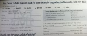
2. High production for low value. This package is a testament to the thousands of nonprofits that spend fundraising dollars on the wrong things. Inside this envelope is a beautiful, glossy, four color, three panel brochure produced on heavy card stock. Included with the brochure is a separate generic reply device and a reply envelope. No cover letter, no personalization (except the incorrect name on the outer envelope), nothing to express appreciation for her being part of their alumni community and no real story. Just a menu of giving options on an expensive brochure.
Takeaway: Spend money where it matters. Invest in a quality letter, personalized to your donor, and to her gift and participation (i.e. volunteer and event attendance) with your organization. Spend extra money on segmentation and/or including an involvement device. These are the things that increase response rates and average gift. Four color glossy card stock is nice, but mostly unnecessary. It certainly didn’t add value to this package.
 3. Crazy ask strategy. We’ve never given a gift to this organization. Ever. Not even $10. We don’t have the philanthropic capacity to make a significant gift at this stage in our lives (we have two young children, a mortgage, etc.). And yet, this organization thought it would be appropriate to ask for (in this order): $10,000, $5,000, $2,200, $1,100, $500 and $100.
There are dozens of reasons they could have picked this ask array. My best guess is that since they spent money on creative instead of strategy, they picked a wide and aggressive array in an effort to capture as many gifts from people at as many giving levels as possible. Regardless of why they did this ask strategy totally missed the mark with us.
Takeaway: First, don’t ask for $10,000 in the mail. That’s a major gift ask, and you really ought to do that face-to-face. Second, don’t ask for $10,000 from someone that has never given you a gift, and that you haven’t talked to in over a decade. Third, build an ask strategy based on your donors’ gift histories. For prospects that have never given before, ease them into supporting your cause by asking for gifts at a lower level first.
Andrew
How right you are!
I cannot believe that with the ability to design pieces on an individual basis that any institution would not find a vendor who can segment the data to represent the range of values that a donor might consider. Not only can the range be variable, but it should allow for some increase and a modest decrease from prior gifts, whether based on the high, an average or most recent. For non donors, the values should be such that it provides an opportunity to participate. Whether that be $10 or $100 depends on many factors including the economy, the audience and the primary objectives of the campaign. One of my goals is increase the number of donors so that they can be cultivated over years to becoming top tier friends of the institution.
In the case of a high school or college it would be possible to personalize either the letter (always should be a letter) with text or graphics that is relevant to the receipient – more than just their name. When I scrub data, I return all names that do not appear to be correct whether spelling, formatting or not fit for the salutation like “J. Smith”. I implore the customer to do some research to get it right!
Taking the time to perfect the strategy will pay huge dividends in the long run. Design factors are also important, but the most critical emotion you want to deliver is the sense of belonging and purpose. Without that you are not going to be able to build a multi-year campaign that sustains your institution.
Thanks for your comments and feedback, David. I was surprised by this “strategy” too.
Spot on Andrew! A great lesson in “What NOT to do”.
Thanks, Rachel! How are you???
This is spot on. Personalization is so important. Penelope Burk’s groundbreaking research in donor-centered fundraising shows us that, first and foremost, donors want us to show them that we know them. That certainly means knowing their name! And it also means sending them a remit card with appropriate ask amounts. There’s no “one size fits all”. Great post.